
Thursday, 20 December 2012


Monday, 17 December 2012
Magazine audience!

 According to Bauer (click logo to go to site) Kerrang have more male readers than females with 57.4% being male whilst 42.6% being female. Their age range is mostly 16-24 year olds with 63.2%, with 25-34 year olds coming in second at 17.4%. They typicalled have artists such as My Chemical Romance who are punk/rock singers and LostProphets who are also rock. It's evident that this magazine focus' on this genre and their audience fits the stereotype of being young and mostly male.


 Vibe magazine is a hip-hop/rap music magazine. It's audience is mostly younger people between the ages of 16-30. This is evident by the people that often appear on the front cover of the magazine. People like Chris Brown, who's music often aims at the younger generation. From the people who often feature on the front of the magazine, it's readers will be people interested in hip-hop music.
 Q music magazine focuses on the 'rock n roll' music. They mostly have a male dominanted reading audience with 67.2% being male. The other 32.8% is obviously female. They have a wider gender range than magazines such as Kerrang where the readers gender is more equal. 38.3% of their readers are aged between 16-24, 23.8% is 25-34 whilst 65+ is 1.8%. Although the younger generations tend to read this more, they have a wider audience than Kerrang and Q clearly attracts more of the older audience than Kerrang. They often feature people such as Coldplay, Muse and Amy Winehouse on there. Their readers will be those interestred in rock music but are slightly more varied than the Kerrang readers.
Sunday, 16 December 2012
Music Magazine!
What is a target audience? It's typically when types like magazines generalise a specific group of people and then aim their product for them. It can be a specific age, gender, martial status etc. Although not everyone will fit into that group of people, they aim for a certain group and interest them.

Stereotypes of particular music fans


Stereotypes of particular music fans

Tuesday, 11 December 2012
Action Plan; Student Magazine!
To improve my blog and the student magazine posts I need to;
- Add an evaluation on the final front cover and contents page. This will need to include improvements and opinions. I will need to add this in as a post by the final front cover.
- I also need to make my blog more structured and sort through the posts. This can be easily done on the main page where it tells you all of the posts.
Monday, 10 December 2012


Evaluation of the contents page!
To the left is a first draft of the contents page. Below is the final draft of the contents page.
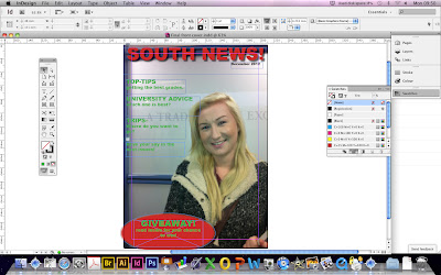
 I added the heading first and decided on the colour using the swatches menu. I then added the text and changed the colour also using the swatches menu. Using the tool box I added the pictures and set them to the highest quality and then moved them around the page to where I wanted them. For the title I used the effect of shadowing to allow it to stand out more and catch the readers attention. I used indesign to make the contents page as it makes it easier to create the magazine style.
To improve I could have used a picture that covers all the background rather than 3 smaller ones. Another way to improve would be to arrange the pictures different as they are plain and are just placed simply so it isn't an effective design and doesn't really catch attention. The contents is plain so I could probably use more colours and a different design.
I will use these points and add them to my music magazine.
This is the tool box I used to help me
create the contents and front cover.
Evaluation of Front Cover!

I then added the mast head and adjusted the colour and font. To change the colour I used the swatches tool and decided one from there. I changed the font and size also by the tools at the top. I inserted the oval at the bottom by the tools and then filled it with the colour I wanted. I added text boxes for the tag-lines and changed the colour to finish it off.
To improve I could have tried to make the magazine look more seasonal by adding christmas themes to it. I could have also used different fonts to attract the readers more. I could use more plugs/puffs, offer more freebies and use pull-quotes.
Contents Photographs!


Here are some of the photographs that I took that could possibly feature on the contents page.
Not all of them will be used, however, some of the better quality picture will.


Sunday, 25 November 2012
Technical Photography!


Allure magazine uses the main image of Eva to draw attention in from readers. They try to place the focus on her eyes as this is based around two of the intersection points. Although her head is mostly in the centre of the magazine, the turning of the face adds interest. As the main feature they're trying to attract you to is her eyes is allows for them to add their plugs/tag lines down the right third. The mast head is also in the top third which means that it isn't effecting the main focus of her face.
Photographs!


I prefer the photo on the right as it's slightly off centre and would although for tag lines/plugs down the third right. Her face is based around two of the focal points so it attracts more attention.


These two photos show simple lines from the poles. However, they down show a great deal of effect. The photo on the left is also a full length shot of a person, whereas, the photo on the right is a medium shot showing from head to waist.


The photo on the left wouldn't be as effective as it shows the whole body and isn't based around a focal point. However, the photo on the left is in the left third and her face is based around two focal points again.
The photo below could also be used as she is on the third left and lines from the poles are used.

Monday, 19 November 2012
Photography: Magazine Layout!

Vanity Fair uses Lady Gaga on the front cover of their magazine. She is placed in the far right third which allows the main titles to be to the left of her. As she is wearing black it allows the magazine to use a white text font which contrasts with the black so this makes them both stand out. Overall, the colours of the magazines are quite dark based, black and grey, however, the white allows them to stand out.

On the other hand, The Source magazine uses a grey background but use bright red font which instantly draws attention to the writing. His eyes are in line with the focal points which attracts attention to his facial expressions. The gun pointing up also draws more attention to his face. The left third is used for the main cover-lines, however, there are cover-lines on the right third but due to the font being smaller it implies they are not the main focus point.
Monday, 12 November 2012
Preliminary Task: Brief. Initial Ideas, Proposal and Flatplan!

Proposal!
The magazine will be aimed at college students, the local community and school leavers who are considering going to the college. Although the age range is fairly wide, it will mostly be aimed at 14-20 years old.
The main content will be university advice, the latest college news, upcoming trips and events, advice on revision, health and relationships and student voices, however, other articles will also be included.
Cover-lines will include main articles inside the magazine, for example, if there's a trip coming up or someone has given an interview about a particular subject.
Although I've not finalised that title, possible suggestions are SDC (south downs college) this is because it's simple and people could easily understand what it is about and the connection it is. 'Fabula' which is latin for story as this way it will appeal to the people reading it as they'd want to read stories.
The fonts will be basic and simple so you could easily read them as you're walking around the college.
It will be published every month to give all the latest events each month.
The main image will probably be taken on the college site. It will most likely contain a college student.
It will either be in A4 or A5 size format. A4 means more information can fit on, however, A5 would be easier as it could fit into people's bags.
The colours would fit the seasons or if there is a big event then they could revolve around that.


Monday, 5 November 2012
Task 4: IPC Case Study
IPC media produces over 85 iconic media brands,
with our print brands alone reaching almost two thirds of UK women and 44% of
UK men- almost 27 million UK adults- while our online brands collectively reach
20 million users every month.
History Of IPC:
UK's three leading
magazine publishers - George Newnes, Odhams Press and Fleetway Publications
merged together to form The International Publishing Corporation Ltd in 1963. IPC magazines was created 5 years later in 1968. IPC
is associated with magazines such as ‘women’s weekly’, ‘Homes and Gardens’, ‘Country
life’ and ‘Marie Claire’. Their
current portfolio of magazines includes; “look”, “chat”, “NME” and “nuts”. IPC
is often associated with “Now”, “Mousebreaker” and “TV times”.
“IPC Media launches digital
magazines on Kindle Fire”
“IPC’s
women’s monthly Marie Claire has partnered with gym chain Nuffield Health to
run what it claims is the UK’s first NFC-enabled magazine advert”


IPC is comprised of three publishing divisions; IPC
Connect, IPC Inspire and IPC Southbank. IPC connect is the women’s division
which focuses on fashion and celebrities including the magazines; “Now” and “Teen
Now”. It also focuses on lifestyle magazines such as “women” and “goodtoknow”,
traditional and real life magazines such as “Women’s Weekly” and “Chat”.
Finally, the last sector is TV and entertainment magazines such as “TV Times”
and “TV easy”.
IPC inspire is the men’s division. It contains many sectors including,
shooting, equestrian, country, marine, sport, lifestyle, music and cycling.
Popular magazine names include; “Nuts”, “horse & hound”, “Shooting Times”
and “NME”.
Finally, IPC Southbank which is the upmarket women’s division. This
contains lifestyles, fashion and home interests. Magazines such as; “Homes and
Gardens”, “Look” and “Marie Claire” are associated with this division.
Current news involving IPC media include;
“IPC Media launches digital
magazines on Kindle Fire”
“IPC’s
women’s monthly Marie Claire has partnered with gym chain Nuffield Health to
run what it claims is the UK’s first NFC-enabled magazine advert”


Tuesday, 23 October 2012
Task 3: Essay!


.jpg)


To what extent should
magazines be held responsible for the social ramifications of the
representations they offer?
Teenage magazines are becoming more popular day
by day, but how are they affecting young girls? With the constant pressure of
having the perfect hair or wearing the latest fashion, are magazines to blame
for the increase in low-self esteem on young girls?
Magazines
frequently discuss the latest trends, boy gossip and male-up issues but it is
argued that this is having a negative impact upon many of the young girls in
modern day society. According to watchdog, teen magazines are to blame for the
young sexualisation of young girls. Girls as young as 10 are consistently
reading magazines which inform readers on the “4 steps to snogging” which is
shown on a cover on ‘Sugar’ magazine whose readers have an average age of just
14. Young readers of ‘sugar’ magazine can read about “the truth about your
teens; virginity, puberty, divorce”. Ed Mayo, chief executive of Consumer Focus said, "There is no doubt that some of these magazines are responsible for the early sexualisation of children." Girls who are below the age of consent are already being given tips on grabbing that perfect boy immediately putting pressure on them over their sexual activity. The media create this 'perfect' image of what a natural and normal body should look like using photo-shop but how achievable is it for young girls to actually reach? Dr Helen Wright said, referring to teenagers, "they are under a huge amount of pressure buffeted by these images and messages." Photo-shop can completely change what someone looks like, erasing spots, changing hair colour and even changing the shape of a person's body. When the celebrities are photo-shopped into having the ideal body shape often the readers will try to achieve this with 79% of teenage girls who self-purge frequently reading women's fitness and health magazines according to http://www.raderprograms.com/causes-statistics/media-eating-disorders.html.
A shocking 81% of ten-year old girls experience a fear of being fat, so are
these magazines aimed at young girls actually having an affect on the way they
see themselves?
Although
many people point out the negatives that magazines have on young girls, they do
also contain useful information and give the readers something to look forward
to. Although the ‘Sugar’ magazine cover which contains “the truth about your
teens; virginity, puberty, divorce” could be seen negatively, it could be
argued that it informs young girls on the next few years of their life.
Although the idea of divorce probably won’t be on 14 year olds minds, it is
important that they read about it. Reading that article could give these young
girls an insight into the down side of growing up showing it’s not all
‘fashion’ and ‘snogging’. It will give them a sense of reality and also give
advice on any future problems. Surely if these young girls are buying
magazines, they enjoy reading them? It gives them something to look forward to
each time the latest edition is released. It could also be argued that at least
they’d be reading rather than continuously playing on the computer. Many
magazines also have an ‘agony aunt’ section where young girls can read and seek
out their problems, so surely it’s better to educate them rather than keep them
in the dark?
Magazines
do have both their positive and negative impacts on society and they change the
way many teenagers view themselves, but are magazines the only thing to blame
when it comes to how young girls perceive themselves? Catwalk models are often
seen as the ‘size 0 girls’. They represent the most glamorous body and are
sometimes viewed as the ‘ideal’ girl. Recent figures suggest that 1 in 100
women has a clinically diagnosed eating disorder (http://anorexiabulimiacare.org.uk/information-and-statistics-media_
) and it’s even been reported
that girls as young as 7 and 8 have been treated at Great Ormond Street
hospital for eating disorders. Cultural secretary Tessa Jowell said that "young women need role models that look like real women, not stick insects on a catwalk." This shows that other factors aside from magazines are having an impact upon the way young girls see themselves and view the way they should look.
In conclusion, although magazines do contribute to the way young girls view themselves and are often accused for sexualising them too early, there are many other factors that also add to anorexia problems, depression and low self-esteem issues. Magazines also give many girls something to look forward to each week and give them a variety of activities to do and can be useful to give young teens advice.
Saturday, 13 October 2012
Task 2: Magazines and Audiences- Part 2!

Glamour is one of the worlds
most popular magazine’s, containing love, sex, beauty, health and fashion tips
as well as the latest celebrity gossip. It’s clear that Glamour aims to target
the female population with the age range of around 18-49 by the colour scheme,
the main image and also the plugs that it uses.
One of the first features
that would appeal to females is the bright and vibrant colour scheme. They are
stereotypically more feminine and the mix of the two instantly grabs your
attention. The use of the colour scheme also suits the month/season that the
magazine was issued which was ‘June 2009’, labelled in the top right, below the
masthead. Beyonce, who this magazine uses as there main image, is also seen as
an independent women and many females aspire to her for this reason. She’s well
known for promoting ‘girl power’ so it is likely women would want to read about
her as she could be seen as a role model to them. The text scattered around the
cover also attracts its female audience. “The 50 best companies to work for if
you’re a woman”, lures the audience in and it almost separates men and women in
the hope that women would want to read this article so they can find the best
place to work because of their gender. It also has the implication that the
magazine is promoting ‘girl power’ which is backed up by the main image of
Beyonce. Aiming at a female audience, gossip is a must on the front cover. The
readers have a choice of the gossip they read into whether it’s Beyonce and how
she “opens up about Jay-Z and ugly days” or “745 high street hits”. With
Beyonce and her husband Jay-Z being a big celebrity couple, female readers are
lured into buying the magazine as they’d be the first to know of the couple’s
gossip. “745 high street hits” also entices the reader in as the use of the
number empathises this huge news. Below gives further information on the “high
street hits” as it shows the prices which are made to sound like a bargain.
This implies that the readers would be working or middle class as they want to
save money where possible but still want to be included on the latest
trends. Finally, one of the last major
features that invite a more female audience is one of the most obvious to a
passer-by. Above the masthead, “Britain’s No1 women’s magazine” is highlighted
in a bold orange. Having this information there gives the suggestion that women
should buy the magazine because so many others do. Women would want to keep on
trend with the most popular magazine and it would also give the buyer a sense
of being part of a community as so many other females buy it.
Glamour magazine use many
designs of a typical front cover. Some of the most evident are the masthead
which is bold and in sans serif font. It stays with the colour scheme, of pink
and orange, and although you cannot read all of it, you still know what it says
as it is such a popular magazine. Numbers are used all over the cover which
draws the attention of the audience in and creates a bigger impression. The
main cover-line which states “win everything” instantly gains attention as not
only does it stand out the most but also offers the opportunity of freebies. Quotes
are used to emphasis the idea of gossip and to tease the readers into wanting
to no more.
Glamour uses many features
to appeal to their target audience of females and it obviously works as it is,
as it states, “Britain’s No1 women’s magazine”!
Subscribe to:
Comments (Atom)