
Thursday, 20 December 2012


Monday, 17 December 2012
Magazine audience!

 According to Bauer (click logo to go to site) Kerrang have more male readers than females with 57.4% being male whilst 42.6% being female. Their age range is mostly 16-24 year olds with 63.2%, with 25-34 year olds coming in second at 17.4%. They typicalled have artists such as My Chemical Romance who are punk/rock singers and LostProphets who are also rock. It's evident that this magazine focus' on this genre and their audience fits the stereotype of being young and mostly male.


 Vibe magazine is a hip-hop/rap music magazine. It's audience is mostly younger people between the ages of 16-30. This is evident by the people that often appear on the front cover of the magazine. People like Chris Brown, who's music often aims at the younger generation. From the people who often feature on the front of the magazine, it's readers will be people interested in hip-hop music.
 Q music magazine focuses on the 'rock n roll' music. They mostly have a male dominanted reading audience with 67.2% being male. The other 32.8% is obviously female. They have a wider gender range than magazines such as Kerrang where the readers gender is more equal. 38.3% of their readers are aged between 16-24, 23.8% is 25-34 whilst 65+ is 1.8%. Although the younger generations tend to read this more, they have a wider audience than Kerrang and Q clearly attracts more of the older audience than Kerrang. They often feature people such as Coldplay, Muse and Amy Winehouse on there. Their readers will be those interestred in rock music but are slightly more varied than the Kerrang readers.
Sunday, 16 December 2012
Music Magazine!
What is a target audience? It's typically when types like magazines generalise a specific group of people and then aim their product for them. It can be a specific age, gender, martial status etc. Although not everyone will fit into that group of people, they aim for a certain group and interest them.

Stereotypes of particular music fans


Stereotypes of particular music fans

Tuesday, 11 December 2012
Action Plan; Student Magazine!
To improve my blog and the student magazine posts I need to;
- Add an evaluation on the final front cover and contents page. This will need to include improvements and opinions. I will need to add this in as a post by the final front cover.
- I also need to make my blog more structured and sort through the posts. This can be easily done on the main page where it tells you all of the posts.
Monday, 10 December 2012


Evaluation of the contents page!
To the left is a first draft of the contents page. Below is the final draft of the contents page.
 I added the heading first and decided on the colour using the swatches menu. I then added the text and changed the colour also using the swatches menu. Using the tool box I added the pictures and set them to the highest quality and then moved them around the page to where I wanted them. For the title I used the effect of shadowing to allow it to stand out more and catch the readers attention. I used indesign to make the contents page as it makes it easier to create the magazine style.
To improve I could have used a picture that covers all the background rather than 3 smaller ones. Another way to improve would be to arrange the pictures different as they are plain and are just placed simply so it isn't an effective design and doesn't really catch attention. The contents is plain so I could probably use more colours and a different design.
I will use these points and add them to my music magazine.
This is the tool box I used to help me
create the contents and front cover.
Evaluation of Front Cover!
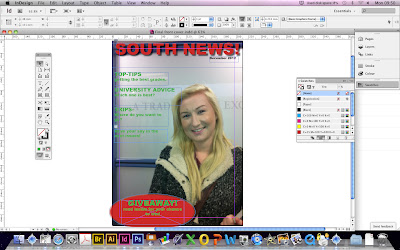

I then added the mast head and adjusted the colour and font. To change the colour I used the swatches tool and decided one from there. I changed the font and size also by the tools at the top. I inserted the oval at the bottom by the tools and then filled it with the colour I wanted. I added text boxes for the tag-lines and changed the colour to finish it off.
To improve I could have tried to make the magazine look more seasonal by adding christmas themes to it. I could have also used different fonts to attract the readers more. I could use more plugs/puffs, offer more freebies and use pull-quotes.
Contents Photographs!


Here are some of the photographs that I took that could possibly feature on the contents page.
Not all of them will be used, however, some of the better quality picture will.


Subscribe to:
Comments (Atom)